A Brief History of Our Posters
As it is 4 in the morning and I know I should be catching some z's before my producer calls I naturally can't get myself to sleep. So here's a recap on how we ended up with our presskit poster.
 TRY-2 is one of the initial ideas for the poster bandied around. Our intrepid graphic designer (Hawzers) was looking to express the idea of headlines without resorting to the usual cliched graphics of a halftone pattern and newsprint. He sought to show something similar by binding the title within a box and cluttering up the type with random caligraphy.
I found it simply too conceptual. You couldn't pick up on the idea of headlines, a romance, or that this was even a poster for a movie. It looks nice, but perhaps for an exhibition about caligraphy.

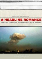
Those two pieces (TRY 4 and 6) came after we discussed using an image. As I found the last posters rather obscure when it came to being about a film, Hawzers decided to use an image as a centerpiece. The end result however was the last poster I'd want for this film. The whole art of the script was how to sidestep the political issues with grace and style. Having a poster with the separation wall or a massive explosion sabotaged the whole process. Those were absolutely a no go (although I did like the type and layout of TRY 4).
 I creamed myself when I got this (TRY -8). It was perfect, it embodied the spirit of a couple at war so simply and so elegantly. The layout and use of typeface brought forth the idea of headlines and the beautiful image of the red pillows was so sumptuous you felt like you wanted to cuddle up right between them. Of course, between the two pillows of heaven lay the dotted separation line and look what a beautiful line Hawzers had drawn! It was hand-scratched giving it a wonderful crafty feel. I was happy. We were there!
 I sent our newly minted poster to all my friends and five minutes later I got this link as a reply. Apparently the Breakup poster was everywhere in LA. Again, it was 'dem Jerry Bruckheimer spies! For the record, though, I still think our poster looks better!

Haw's other suggestion (TRY-10) was also pretty striking. I loved the yellow color and the map. The illustration itself apparently came from a Letraset and was scanned and enlarged. Sadly, I don't think it really looked much like a bed. Also, tying it to a specific map with clear words threw the poster in the land of political documentary again. This is where the ideas finally came together; to bring the map to the bed whilst using the headline layout. For the result see the previous post.
 TRY-2 is one of the initial ideas for the poster bandied around. Our intrepid graphic designer (Hawzers) was looking to express the idea of headlines without resorting to the usual cliched graphics of a halftone pattern and newsprint. He sought to show something similar by binding the title within a box and cluttering up the type with random caligraphy.
I found it simply too conceptual. You couldn't pick up on the idea of headlines, a romance, or that this was even a poster for a movie. It looks nice, but perhaps for an exhibition about caligraphy.


Those two pieces (TRY 4 and 6) came after we discussed using an image. As I found the last posters rather obscure when it came to being about a film, Hawzers decided to use an image as a centerpiece. The end result however was the last poster I'd want for this film. The whole art of the script was how to sidestep the political issues with grace and style. Having a poster with the separation wall or a massive explosion sabotaged the whole process. Those were absolutely a no go (although I did like the type and layout of TRY 4).
 I creamed myself when I got this (TRY -8). It was perfect, it embodied the spirit of a couple at war so simply and so elegantly. The layout and use of typeface brought forth the idea of headlines and the beautiful image of the red pillows was so sumptuous you felt like you wanted to cuddle up right between them. Of course, between the two pillows of heaven lay the dotted separation line and look what a beautiful line Hawzers had drawn! It was hand-scratched giving it a wonderful crafty feel. I was happy. We were there!
 I sent our newly minted poster to all my friends and five minutes later I got this link as a reply. Apparently the Breakup poster was everywhere in LA. Again, it was 'dem Jerry Bruckheimer spies! For the record, though, I still think our poster looks better!
Haw's other suggestion (TRY-10) was also pretty striking. I loved the yellow color and the map. The illustration itself apparently came from a Letraset and was scanned and enlarged. Sadly, I don't think it really looked much like a bed. Also, tying it to a specific map with clear words threw the poster in the land of political documentary again. This is where the ideas finally came together; to bring the map to the bed whilst using the headline layout. For the result see the previous post.
posted by the fdz at 3:44 am
![]()

0 Comments:
Post a Comment
<< Home